title: (deprecated) type: references group: Build-in Components order: 8.22 version: 2.1
v0.6.1+
deprecated: This built-in component will be deprecated soon. There‘re some reasons for this deprecation, such as the inconsistency of user experience on different ends, and the component’s appearance sometimes being not as expected. Therefore we strongly suggest developers build this component as a customized component using weex's DSL and its rendering ability.
<switch> is a checkbox-like UI component.
Note: The appearance of switch component is a bit of different in three ends (iOS, Android, Web) in consideration of different platform styles.
| Android | Web | iOS |
|---|---|---|
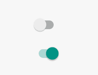 | 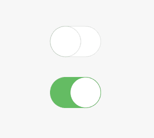 | 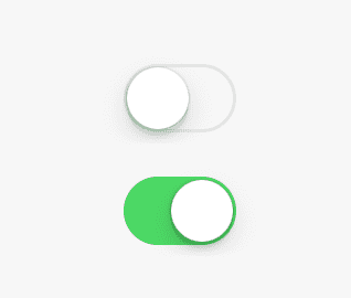 |
Note: Layout style attributes listed below such as
width,height,marginare not supported.
Basic Usage
<switch></switch>
See the example.
Attributes
| Attribute | Type | Value | Default Value |
|---|---|---|---|
checked | Boolean | true / false | false |
disabled | Boolean | true / false | false |
checked
Indicates this component's status is set to true or false.
disabled
Indicates this component is not available for interaction.
Component Methods
None.
Events
appear/disappearevent. check out common eventsclick/longpress: check out common eventschange: check out common events
Parameters of events' object for onchange event:
value: the value of the component who dispatched this event, which is the boolean value true or false.timestamp: the time stamp of the event.
Styles
Notes: There are several style properties that you mustn't use on this component. And here are all the invalid properties:
widthheightmin-widthmin-heightmarginandmargin-xxxpaddingandpadding-xxxborderandborder-xxx
Notes: If the container of
<switch>is not set toalign-items:flex-start, the switch in android will be stretched.
common styles: check out common styles for components
Usage Notes
- The
widthandheightin the styles of<switch>won‘t effect the component’s apparence and layout. <switch>can not have any nested child component.