title: 通用样式 type: wiki group: 样式 order: 3.1 version: 2.1
所有 Weex 组件都支持以下通用样式规则。
盒模型

Weex 盒模型基于 CSS 盒模型,每个 Weex 元素都可视作一个盒子。我们一般在讨论设计或布局时,会提到「盒模型」这个概念。
盒模型描述了一个元素所占用的空间。每一个盒子有四条边界:外边距边界 margin edge, 边框边界 border edge, 内边距边界 padding edge 与内容边界 content edge。这四层边界,形成一层层的盒子包裹起来,这就是盒模型大体上的含义。
注意: Weex 对于长度值目前只支持像素值,不支持相对单位(em、rem)。
width {length}:,默认值autoheight {length}:,默认值autodirection {string}: 可选值为rtl|ltr,默认值为ltrpadding {length}:内边距,内容和边框之间的距离。默认值 0可有如下写法:
padding-left {length}:,默认值 0padding-right {length}:,默认值 0padding-top {length}:,默认值 0padding-bottom {length}:,默认值 0
margin:外边距,元素和元素之间的空白距离。值类型为 length,默认值 0
可有如下写法:
margin-left {length}:,默认值 0margin-right {length}:,默认值 0margin-top {length}:,默认值 0margin-bottom {length}:,默认值 0
border:
设定边框,
border目前不支持类似这样border: 1 solid #ff0000;的组合写法。可有如下写法:
border-style:设定边框样式,值类型为 string,可选值为
solid|dashed|dotted,默认值solid可有如下写法:
border-left-style {string}:可选值为solid|dashed|dotted,默认值solidborder-top-style {string}:可选值为solid|dashed|dotted,默认值solidborder-right-style {string}:可选值为solid|dashed|dotted,默认值solidborder-bottom-style {string}:可选值为solid|dashed|dotted,默认值solid
border-width {length}:设定边框宽度,非负值, 默认值 0
可有如下写法:
border-left-width {length}:,非负值, 默认值 0border-top-width {length}:,非负值, 默认值 0border-right-width {length}:,非负值, 默认值 0border-bottom-width {length}:,非负值, 默认值 0
border-color {color}:设定边框颜色,默认值
#000000可有如下写法:
border-left-color {color}:,默认值#000000border-top-color {color}:,默认值#000000border-right-color {color}:,默认值#000000border-bottom-color {color}:,默认值#000000
border-radius {length}:设定圆角,默认值 0
可有如下写法:
border-bottom-left-radius {length}:,非负值, 默认值 0border-bottom-right-radius {length}:,非负值, 默认值 0border-top-left-radius {length}:,非负值, 默认值 0border-top-right-radius {length}:,非负值, 默认值 0
注意:
Weex 盒模型的 box-sizing 默认为 border-box,即盒子的宽高包含内容、内边距和边框的宽度,不包含外边距的宽度。
警告 尽管
overflow:hidden在 Android 上是默认行为,但只有下列条件都满足时,一个父 view 才会去 clip 它的子 view。这个限制只对 Android 生效,iOS 不受影响。
- 父view是
div,a,cell,refresh或loading。- 系统版本是 Android 4.3 或更高。
- 系统版本不是 Andorid 7.0。
- 父 view 没有
background-image属性或系统版本是 Android 5.0 或更高。
示例:
<template>
  <div>
    <image  style="width: 400px; height: 200px; margin-left: 20px;" src="https://g.alicdn.com/mtb/lab-zikuan/0.0.18/weex/weex_logo_blue@3x.png"></image>
  </div>
</template>
Flexbox
Weex 布局模型基于 CSS Flexbox,以便所有页面元素的排版能够一致可预测,同时页面布局能适应各种设备或者屏幕尺寸。
Flexbox 包含 flex 容器和 flex 成员项。如果一个 Weex 元素可以容纳其他元素,那么它就成为 flex 容器。需要注意的是,flexbox 的老版规范相较新版有些出入,比如是否能支持 wrapping。这些都描述在 W3C 的工作草案中了,你需要注意下新老版本之间的不同。另外,老版本只在安卓 4.4 版以下得到支持。
Flex 容器
在 Weex 中,Flexbox 是默认且唯一的布局模型,所以你不需要手动为元素添加 display: flex; 属性。
flex-direction:定义了 flex 容器中 flex 成员项的排列方向。可选值为
row|column,默认值为columncolumn:从上到下排列。row:从左到右排列。
justify-content:定义了 flex 容器中 flex 成员项在主轴方向上如何排列以处理空白部分。可选值为
flex-start|flex-end|center|space-between,默认值为flex-start。flex-start:是默认值,所有的 flex 成员项都排列在容器的前部;flex-end:则意味着成员项排列在容器的后部;center:即中间对齐,成员项排列在容器中间、两边留白;space-between:表示两端对齐,空白均匀地填充到 flex 成员项之间。

align-items:定义了 flex 容器中 flex 成员项在纵轴方向上如何排列以处理空白部分。可选值为
stretch|flex-start|center|flex-end,默认值为stretch。stretch是默认值,即拉伸高度至 flex 容器的大小;flex-start则是上对齐,所有的成员项排列在容器顶部;flex-end是下对齐,所有的成员项排列在容器底部;center是中间对齐,所有成员项都垂直地居中显示。

Flex 成员项
flex 属性定义了 flex 成员项可以占用容器中剩余空间的大小。如果所有的成员项设置相同的值 flex: 1,它们将平均分配剩余空间. 如果一个成员项设置的值为 flex: 2,其它的成员项设置的值为 flex: 1,那么这个成员项所占用的剩余空间是其它成员项的2倍。
flex {number}:值为 number 类型。
示例
一个简单的网格布局。

<template>
  <div>
    <div v-for="(v, i) in list" class="row">
      <div v-for="(text, k) in v" class="item">
        <div>
          <text>{{text}}</text>
        </div>
      </div>
    </div>
  </div>
</template>
<style scoped>
  .item{
    flex:1;
    justify-content: center;
    align-items:center;
    border-width:1;
  }
  .row{
    flex-direction: row;
    height:80px;
  }
</style>
<script>
  module.exports = {
    data: function () {
      return {
        list:[
          ['A', 'B', 'C'],
          ['D', 'E', 'F'],
          ['G', 'H', 'I']
        ]
      }
    }
  }
</script>
一个在相对于屏幕水平居中,全屏居中的 <div>。
<template>
  <div class="wrapper">
    <div class="box">
    </div>
  </div>
</template>

<style scoped>
  .wrapper {
    position: absolute;
    top: 0;
    right: 0;
    bottom: 0;
    left: 0;
    background-color: #cccccc;
    justify-content: center;
    align-items: center;
  }
  .box {
    width: 200px;
    height: 200px;
    background-color: #fc0000;
  }
</style>
定位
Weex 支持 position 定位,用法与 CSS position 类似。为元素设置 position 后,可通过 top、right、bottom、left 四个属性设置元素坐标。
position {string}:设置定位类型。可选值为
relative|absolute|fixed|sticky,默认值为relative。relative是默认值,指的是相对定位;absolute是绝对定位,以元素的容器作为参考系;fixed保证元素在页面窗口中的对应位置显示;sticky指的是仅当元素滚动到页面之外时,元素会固定在页面窗口的顶部。
top {number}:距离上方的偏移量,默认为 0。bottom {number}:距离下方的偏移量,默认为 0。left {number}:距离左方的偏移量,默认为 0。right {number}:距离右方的偏移量,默认为 0。
注意:
- Weex 目前不支持
z-index设置元素层级关系,但靠后的元素层级更高,因此,对于层级高的元素,可将其排列在后面。 - 如果定位元素超过容器边界,在 Android 下,超出部分将不可见,原因在于 Android 端元素
overflow默认值为hidden,但目前 Android 暂不支持设置overflow: visible。
示例

<template scoped>
  <div class="wrapper">
    <div class="box box1">
    </div>
    <div class="box box2">
    </div>
    <div class="box box3">
    </div>
  </div>
</template>

<style>
  .wrapper {
    position: absolute;
    top: 0;
    right: 0;
    bottom: 0;
    left: 0;
    background-color: #cccccc;
  }
  .box {
    width: 400px;
    height: 400px;
    position: absolute;
  }
  .box1 {
    top: 0;
    left: 0;
    background-color: #ff0000;
  }
  .box2 {
    top: 150px;
    left: 150px;
    background-color: #0055dd;
  }
  .box3 {
    top: 300px;
    left: 300px;
    background-color: #00ff49;
  }
</style>
transition v0.16.0+
现在您可以在CSS中使用transition属性来提升您应用的交互性与视觉感受,transition中包括布局动画,即LayoutAnimation,现在布局产生变化的同时也能使用transition带来的流畅动画。transition允许CSS的属性值在一定的时间区间内平滑地过渡。
参数
transition-property:允许过渡动画的属性名,设置不同样式transition效果的键值对,默认值为空,表示不执行任何transition,下表列出了所有合法的参数属性:
| 参数名 | 描述 |
|---|---|
| width | transition过渡执行的时候是否组件的宽度参与动画 |
| height | transition过渡执行的时候是否组件的高度参与动画 |
| top | transition过渡执行的时候是否组件的顶部距离参与动画 |
| bottom | transition过渡执行的时候是否组件的底部距离参与动画 |
| left | transition过渡执行的时候是否组件的左侧距离参与动画 |
| right | transition过渡执行的时候是否组件的右侧距离参与动画 |
| backgroundColor | transition过渡执行的时候是否组件的背景颜色参与动画 |
| opacity | transition过渡执行的时候是否组件的不透明度参与动画 |
| transform | transition过渡执行的时候是否组件的变换类型参与动画 |
transition-duration:指定transition过渡的持续时间 (单位是毫秒),默认值是0,表示没有动画效果。transition-delay:指定请求transition过渡操作到执行transition过渡之间的时间间隔 (单位是毫秒或者秒),默认值是0,表示没有延迟,在请求后立即执行transition过渡。transition-timing-function:描述transition过渡执行的速度曲线,用于使transition过渡更为平滑。默认值是ease。下表列出了所有合法的属性:
| 属性名 | 描述 |
|---|---|
| ease | transition过渡逐渐变慢的过渡效果 |
| ease-in | transition过渡慢速开始,然后变快的过渡效果 |
| ease-out | transition过渡快速开始,然后变慢的过渡效果 |
| ease-in-out | transition过渡慢速开始,然后变快,然后慢速结束的过渡效果 |
| linear | transition过渡以匀速变化 |
| cubic-bezier(x1, y1, x2, y2) | 使用三阶贝塞尔函数中自定义transition变化过程,函数的参数值必须处于 0 到 1 之间。更多关于三次贝塞尔的信息请参阅 cubic-bezier 和 Bézier curve. |
示例
<style scoped>
    .panel {
        margin: 10px;
        top:10px;
        align-items: center;
        justify-content: center;
        border: solid;
        border-radius: 10px;

        transition-property: width,height,backgroundColor;
        transition-duration: 0.3s;
        transition-delay: 0s;
        transition-timing-function: cubic-bezier(0.25, 0.1, 0.25, 1.0);
    }
</style>
transform
注意:除了
perspective和transform-origin,transition支持了transform的全部能力。
transform 属性向元素应用 2D/3D 转换。该属性允许我们对元素进行旋转、缩放、移动或倾斜。
目前支持的 transform 声明格式:
- translate( <number/percentage> [, <number/percentage>]?)
- translateX( <number/percentage> )
- translateY( <number/percentage> )
- scale( )
- scaleX( )
- scaleY( )
- rotate( <angle/degree> )
- rotateX( <angle/degree> ) v0.14+
- rotateY( <angle/degree> ) v0.14+
- perspective( ) Android 4.1及以上版本支持 v0.16+
- transform-origin: number/percentage/keyword(top/left/right/bottom)
示例
<template>
  <div class="wrapper">
    <div class="transform">
     <text class="title">Transformed element</text>
    </div>
  </div>
</template>

<style>
  .transform {
    align-items: center;
    transform: translate(150px,200px) rotate(20deg);
    transform-origin: 0 -250px;
    border-color:red;
    border-width:2px;
  }
  .title {font-size: 48px;}
</style>
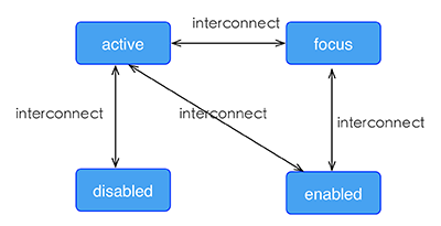
伪类 v0.9.5+
Weex 支持四种伪类:active, focus, disabled, enabled
所有组件都支持 active, 但只有 input 组件和 textarea 组件支持 focus, enabled, disabled。
规则
同时生效的时候,优先级高覆盖优先级低
- 例如:
input:active:enabled和input:active同时生效,前者覆盖后者
- 例如:
互联规则如下所示
示例
<template>
  <div class="wrapper">
    <image :src="logoUrl" class="logo"></image>
  </div>
</template>

<style scoped>
  .wrapper {
    align-items: center;
    margin-top: 120px;
  }
  .title {
    font-size: 48px;
  }
  .logo {
    width: 360px;
    height: 82px;
    background-color: red;
  }
  .logo:active {
    width: 180px;
    height: 82px;
    background-color: green;
  }
</style>

<script>
  export default {
    props: {
      logoUrl: {
        default: 'https://alibaba.github.io/weex/img/weex_logo_blue@3x.png'
      },
      target: {
        default: 'World'
      }
    },
    methods: {
      update (e) {
        this.target = 'Weex';
      }
    }
  };
</script>
线性渐变 v0.10+
Weex 支持线性渐变背景,具体介绍可参考 W3C description of the gradient。
所有组件均支持线性渐变。
使用
你可以通过 background-image 属性创建线性渐变。
background-image: linear-gradient(to top,#a80077,#66ff00);
目前暂不支持 radial-gradient(径向渐变)。
Weex 目前只支持两种颜色的渐变,渐变方向如下:
- to right 从左向右渐变
- to left 从右向左渐变
- to bottom 从上到下渐变
- to top 从下到上渐变
- to bottom right 从左上角到右下角
- to top left 从右下角到左上角
Note
background-image优先级高于background-color,这意味着同时设置background-image和background-color,background-color被覆盖。- 不要使用
background简写.
示例
<template>
  <scroller style="background-color: #3a3a3a">
    <div class="container1" style="background-image:linear-gradient(to right,#a80077,#66ff00);">
      <text class="direction">to right</text>
    </div>
    <div class="container1" style="background-image:linear-gradient(to left,#a80077,#66ff00);">
      <text class="direction">to left</text>
    </div>
    <div class="container1" style="background-image:linear-gradient(to bottom,#a80077,#66ff00);">
      <text class="direction">to bottom</text>
    </div>
    <div class="container1" style="background-image:linear-gradient(to top,#a80077,#66ff00);">
      <text class="direction">to top</text>
    </div>
    <div style="flex-direction: row;align-items: center;justify-content: center">
      <div class="container2" style="background-image:linear-gradient(to bottom right,#a80077,#66ff00);">
        <text class="direction">to bottom right</text>
      </div>
      <div class="container2" style="background-image:linear-gradient(to top left,#a80077,#66ff00);">
        <text class="direction">to top left</text>
      </div>
    </div>
  </scroller>
</template>
<style>
  .container1 {
    margin: 10px;
    width: 730px;
    height: 200px;
    align-items: center;
    justify-content: center;
    border: solid;
    border-radius: 10px;
  }

  .container2 {
    margin: 10px;
    width: 300px;
    height: 300px;
    align-items: center;
    justify-content: center;
    border: solid;
    border-radius: 10px;
  }

  .direction {
    font-size: 40px;
    color: white;
  }
</style>
阴影(box-shadow) v0.11+
Weex 支持阴影属性:active, focus, disabled, enabled inset(可选),offset-x,offset-y, blur-radius,color
注意
- box-shadow仅仅支持iOS
示例
<template>
  <div class="wrapper">
    <div style="width:400px; height:60px;background-color: #FFE4C4; box-shadow:20px  10px rgb(255, 69, 0);">
      <text class="title" style="text-align: center">Hello {{target}}</text>
    </div>
    <div style="margin-top: 80px;width:400px; height:60px;background-color: #FFE4C4; box-shadow: 20px  10px 5px rgba(255, 69, 0, 0.8);">
      <text class="title" style="text-align: center">Hello {{target}}</text>
    </div>
    <div style="margin-top: 80px;width:400px; height:60px;background-color: #FFE4C4; box-shadow:inset 20px  10px 5px rgba(255, 69, 0, 0.8);">
      <text class="title" style="text-align: center">Hello {{target}}</text>
    </div>
    <div style="margin-top: 80px;width:400px; height:60px;background-color: #FFE4C4; box-shadow:inset 20px  10px 5px rgb(255, 69, 0);">
      <text class="title" style="text-align: center">Hello {{target}}</text>
    </div>
    <div style="margin-top: 80px;width:400px; height:60px;background-color: #FFE4C4; box-shadow:20px  10px 5px black;">
      <text class="title" style="text-align: center">Hello {{target}}</text>
    </div>
    <div style="margin-top: 80px;width:400px; height:60px;background-color: #FFE4C4; box-shadow:20px  10px 5px #008B00;">
      <text class="title" style="text-align: center">Hello {{target}}</text>
    </div>
  </div>
</template>

<style scoped>
  .wrapper {align-items: center; margin-top: 120px;}
  .title {font-size: 48px;}
</style>

<script>
  module.exports = {
    data: function () {
      return {
        logoUrl: 'https://alibaba.github.io/weex/img/weex_logo_blue@3x.png',
        target: 'World'
      };
    }
  };
</script>
其他基本样式
opacity {number}:取值范围为 [0, 1] 区间。默认值是 1,即完全不透明;0 是完全透明;0.5 是 50% 的透明度。background-color {color}:设定元素的背景色,可选值为色值,支持RGB(rgb(255, 0, 0));RGBA(rgba(255, 0, 0, 0.5));十六进制(#ff0000);精简写法的十六进制(#f00);色值关键字(red),默认值是transparent。
注意: 色值的关键字列表。
上手样式
如果对于样式写法需要更多上手参考,可参考每个组件的文档中,都有常见的例子可供参考。
你可以按照以下步骤来规划 Weex 页面的样式。
- 全局样式规划:将整个页面分割成合适的模块。
- flex 布局:排列和对齐页面模块。
- 定位盒子:定位并设置偏移量。
- 细节样式处理:增加特定的具体样式。