title: Common Styles type: wiki group: Style order: 3.1 version: 2.1
All of weex tags share some common style rules
Box Model

Weex box model based on the CSS box model, all of weex elements can be considered as boxes. The term “box model” is used when talking about design and layout. The box model is essentially a box that wraps around every HTML element. It consists of margins, borders, paddings, and the actual content.
you can use the definition below in weex box model.
width:lengthtype, default valueautoheight:lengthtype, default valueautodirection: valuesrtl|ltr, default valueltrpadding:lengthtype, default value0, (space around content, between element content and the element border)padding-left:lengthtype, default value0padding-right:lengthtype, default value0padding-top:lengthtype, default value0padding-bottom:lengthtype, default value0
margin:lengthtype, default value0, (space around elements, outside the border)margin-left:lengthtype, default value0margin-right:lengthtype, default value0margin-top:lengthtype, default value0margin-bottom:lengthtype, default value0
borderborder-style: valuessolid|dashed|dotted, default valuesolidborder-left-style: valuessolid|dashed|dotted, default valuesolidborder-top-style: valuessolid|dashed|dotted, default valuesolidborder-right-style: valuessolid|dashed|dotted, default valuesolidborder-bottom-style: valuessolid|dashed|dotted, default valuesolid
border-width:lengthtype, non-negative, default value0border-left-width:lengthtype, non-negative, default value0border-top-width:lengthtype, non-negative, default value0border-right-width:lengthtype, non-negative, default value0border-bottom-width:lengthtype, non-negative, default value0
border-color:colortype, default value#000000border-left-color:colortype, default value#000000border-top-color:colortype, default value#000000border-right-color:colortype, default value#000000border-bottom-color:colortype, default value#000000
border-radius:lengthtype, default value0, (rounded borders to elements , default value is 0 meaning right angle )border-bottom-left-radius:lengthtype, non-negative, default value0border-bottom-right-radius:lengthtype, non-negative, default value0border-top-left-radius:lengthtype, non-negative, default value0border-top-right-radius:lengthtype, non-negative, default value0
Notes
Weex box model uses border-box as the default value of box-sizing, meaning the width and height properties includes content, padding and border, but not the margin.
Waring Although
overflow:hiddenis default on android, a view will not clip its children according toborder-radiusunless all the following condtions met. This only happens on Android, it works fine on iOS.
- The view type is
div,a,cell,refreshorloading.- OS version is Android 4.3 or higher.
- OS version is not Andorid 7.0
- A view does not have
background-imageproperty nor OS version is Android 5.0 or higher.
Example
<template>
  <div>
    <image src="..." style="width: 400; height: 200; margin-left: 20;"></image>
  </div>
</template>
Flexbox
Weex box style model based on the CSS flexbox, ensures that elements behave predictably and the page layout can accommodates to different screen sizes and different display devices.
Flexbox consists of flex containers and flex items. If a weex element can containing other elements, it is a flex container.
Notice that the old version of flexbox specification has differences with the new ones, such as whether or not to support wrapping. This is described at w3c's working drafts, and you should notice the differences among them. Also notice that the old version is only supported below the 4.4 version of android.
Flex container
Flexbox is the default and only style model in Weex, so you don't have to add display: flex; in a container.
flex-direction: valuesrow|column, default valuecolumn
The flex-direction property specifies the direction of the flexible items inside the flex container. Default value is column (top-to-bottom).
justify-content: valuesflex-start|flex-end|center|space-between, default valueflex-start
The justify-content property horizontally aligns the flexible container's items when the items do not use all available space on the main-axis. Default value is flex-start meaning the flex items are positioned at the beginning of the container. flex-end means the items are positioned at the end of the container. center means the items are positioned at the center of the container. space-between means the items are positioned with space between the lines.

align-items: valuesstretch|flex-start|center|flex-end, default valuestretch
The align-items property vertically aligns the flexible container's items when the items do not use all available space on the cross-axis. Default value is stretch meaning the items are stretched to fit the container. flex-start means the items are positioned at the top of the container; flex-end means the items are positioned at the bottom of the container; center means items are positioned at the center of the container (vertically).

Flex item
flex:numbertype, default value0
the flex property specifies the length of the flex item, relative to the rest of the flex items inside the same container. If all of the flex items set flex: 1, they will have equal width or height on direction of flex container‘s flex-direction. If there are two flex items, with one setting flex: 1, and the other setting flex: 2, the first one will take 1/3 container space, and the second one will take 2/3 container space. If all of flex items don’t set flex, they will be aligned depending on the container's justify-content property.
Examples
a list of images with equal scales align at the vertical axis:
<template>
  <div style="width: 300; height: 100;">
    <image src="..." style="flex: 1;"></image>
    <image src="..." style="flex: 1;"></image>
    <image src="..." style="flex: 1;"></image>
  </div>
</template>
a image with fixed width aligns with a stretched text:
<template>
  <div style="width: 300; height: 100;">
    <image src="..." style="width: 100; height: 100;"></image>
    <text style="flex: 1;">...</text>
  </div>
</template>
mixed direction alignment:
<template>
  <div style="width: 100;">
    <image src="..." style="width: 100; height: 100;"></image>
    <div style="flex-direction: row;">
      <text style="flex: 2; font-size: 32;">title</text>
      <text style="flex: 1; font-size: 16;">$100</text>
    </div>
  </div>
</template>
one text align left , the other float right:

<template>
<div style="flex-direction: row; justify-content: space-between;">
   <text>WEEX</text>
   <text>2016-05-08</text>
</div>
</template>
Position
we can use properties below to control placement of weex tag
position: valuesrelative|absolute|fixed|sticky, default valuerelative
relative means the item is positioned relative to its normal position. absolute means the item is positioned relative to its container. fixed keeps the elements position fixed when the page is scrolling. sticky keeps elements positioned inside the viewport as “stuck” at the top or “relative” at its original place depending on whether does it about to scroll out of the view.
top:numbertype, default value0, upward offset valuebottom:numbertype, default value0, downward offset valueleft:numbertype, default value0, leftward offset valueright:numbertype, default value0, rightward offset value
Examples
<template>
  <div style="flex-direction: column;">
    <div style="height: 3000;">
      <image src="..." style="top: 50px; left: 50px;"></image>
    </div>
    <div style="height: 3000;">
      <image src="..." style="position: sticky;"></image>
    </div>
    <div style="height: 3000;">
      <image src="..." style="position: absolute; top: 50px; left: 50px;"></image>
    </div>
  </div>
</template>
transition v0.17.0+
Now you can use the transition attribute in CSS to enhance the interactivity and visual experience of your application. The transition includes the layout animation, that is, LayoutAnimation, which now changes the layout and uses the fluent animation of the transition. Transition allows the CSS attribute values to transition smoothly over a certain time interval.
Property
transition-property:Allows the name of the transitional animation to set the value of the different styles transition effect, the default value is empty, that does not perform any transition, the following table lists all the legitimate parameters of the property:
| Property | Description |
|---|---|
| width | The transition is performed when the width of the component is involved in the animation |
| height | The transition is performed when the height of the component is involved in the animation |
| top | The transition is performed when the top of the component is involved in the animation |
| bottom | The transition is performed when the bottom of the component is involved in the animation |
| left | The transition is performed when the left of the component is involved in the animation |
| right | The transition is performed when the right of the component is involved in the animation |
| backgroundColor | The transition is performed when the backgroundColor of the component is involved in the animation |
| opacity | The transition is performed when the opacity of the component is involved in the animation |
| transform | The transition is performed when the transform of the component is involved in the animation |
transition-duration:Specifies the duration of the transition transition (in milliseconds). The default value is 0, indicating that there is no animation.transition-delay:Specifies the time interval (in milliseconds or seconds) between the request transition transition and the transition transition. The default value is 0, indicating that there is no delay, and the transition transition is performed immediately after the request.transition-timing-function:Describes the velocity curve of the transition transition, which is used to make the transition transition smoother. The default is ease. The following table lists all the valid attributes:
| Property | Description |
|---|---|
| ease | The transition gradually slow down the transition effect |
| ease-in | The transition starts slowly and then becomes faster for the transition effect |
| ease-out | The transition starts quickly and then slows the transition effect |
| ease-in-out | The transition starts slowly, then goes fast and then slowly ends the transition effect |
| linear | The transition changes at constant speed |
| cubic-bezier(x1, y1, x2, y2) | Using the custom transition in the third-order Bessel function, the parameter values of the function must be between 0 and 1. For more information on three times Bessel, see cubic-bezier and Bézier curve. |
Example
<style scoped>
    .panel {
        margin: 10px;
        top:10px;
        align-items: center;
        justify-content: center;
        border: solid;
        border-radius: 10px;

        transition-property: width,height,backgroundColor;
        transition-duration: 0.3s;
        transition-delay: 0s;
        transition-timing-function: cubic-bezier(0.25, 0.1, 0.25, 1.0);
    }
</style>
transform
Note: Consider use
transitioninstead, which supports all the style thattransformsupports except fortransform-originandperspective
The CSS transform property lets you modify the coordinate space of the CSS visual formatting model. Using it, elements can be translated, rotated and scaled.
Currently supported format:
- translate( <number/percentage> [, <number/percentage>]?)
- translateX( <number/percentage> )
- translateY( <number/percentage> )
- scale( )
- scaleX( )
- scaleY( )
- rotate( <angle/degree> )
- rotateX( <angle/degree> ) v0.14+
- rotateY( <angle/degree> ) v0.14+
- perspective( ), supported for Android 4.1 and above. v0.16+
- transform-origin: number/percentage/keyword(top/left/right/bottom)
Example
<template>
  <div class="wrapper">
    <div class="transform">
     <text class="title">Transformed element</text>
    </div>
  </div>
</template>

<style>
  .transform {
    align-items: center;
    transform: translate(150px,200px) rotate(20deg);
    transform-origin: 0 -250px;
    border-color:red;
    border-width:2px;
  }
  .title {font-size: 48px;}
</style>
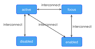
Pseudo class v0.9.5+
Weex support four pseudo-classes: active, focus, disabled, enabled
All components support active, but only the input component and the textarea component support focus, enabled, diabled.
Rule
the high priority override low priority when rules take effect at the same time
- such as: “input:active:enabled” will override “input:active”
the interconnection rule as follow
Example
<template>
  <div class="wrapper">
    <image :src="logoUrl" class="logo"></image>
  </div>
</template>

<style scoped>
  .wrapper {
    align-items: center;
    margin-top: 120px;
  }
  .title {
    font-size: 48px;
  }
  .logo {
    width: 360px;
    height: 82px;
    background-color: red;
  }
  .logo:active {
    width: 180px;
    height: 82px;
    background-color: green;
  }
</style>

<script>
  export default {
    props: {
      logoUrl: {
        default: 'https://alibaba.github.io/weex/img/weex_logo_blue@3x.png'
      },
      target: {
        default: 'World'
      }
    },
    methods: {
      update (e) {
        this.target = 'Weex';
      }
    }
  };
</script>
linear-gradient v0.10+
Weex support linear-gradient background, You can see W3C description of the gradient.
Supported components
All components in Weex support gradients
Usage
You can use linear gradient by background-image property.
background-image: linear-gradient(to top,#a80077,#66ff00);
radial-gradient is not currently supported, do not use it.
Weex currently supports two color gradients. The direction of the gradient is as follows:
- to right From left to right
- to left From right to left
- to bottom From top to bottom
- to top From bottom to top
- to bottom right From the upper left corner to the lower right corner
- to top left From the lower right corner to the upper left corner
Note
background-imageandbackground-colorare set at the same time,background-imageprecedesbackground-color.- Do not use shorthand property such as
background.
Example
<template>
  <scroller style="background-color: #3a3a3a">
    <div class="container1" style="background-image:linear-gradient(to right,#a80077,#66ff00);">
      <text class="direction">to right</text>
    </div>
    <div class="container1" style="background-image:linear-gradient(to left,#a80077,#66ff00);">
      <text class="direction">to left</text>
    </div>
    <div class="container1" style="background-image:linear-gradient(to bottom,#a80077,#66ff00);">
      <text class="direction">to bottom</text>
    </div>
    <div class="container1" style="background-image:linear-gradient(to top,#a80077,#66ff00);">
      <text class="direction">to top</text>
    </div>
    <div style="flex-direction: row;align-items: center;justify-content: center">
      <div class="container2" style="background-image:linear-gradient(to bottom right,#a80077,#66ff00);">
        <text class="direction">to bottom right</text>
      </div>
      <div class="container2" style="background-image:linear-gradient(to top left,#a80077,#66ff00);">
        <text class="direction">to top left</text>
      </div>
    </div>
  </scroller>
</template>
<style>
  .container1 {
    margin: 10px;
    width: 730px;
    height: 200px;
    align-items: center;
    justify-content: center;
    border: solid;
    border-radius: 10px;
  }

  .container2 {
    margin: 10px;
    width: 300px;
    height: 300px;
    align-items: center;
    justify-content: center;
    border: solid;
    border-radius: 10px;
  }

  .direction {
    font-size: 40px;
    color: white;
  }
</style>
box-shadow v0.11+
Weex supports box-shadow in iOS: inset,offset-x,offset-y, blur-radius,color
Note
- box-shadow takes effect in iOS
Example
<template>
  <div class="wrapper">
    <div style="width:400px; height:60px;background-color: #FFE4C4; box-shadow:20px  10px rgb(255, 69, 0);">
      <text class="title" style="text-align: center">Hello {{target}}</text>
    </div>
    <div style="margin-top: 80px;width:400px; height:60px;background-color: #FFE4C4; box-shadow: 20px  10px 5px rgba(255, 69, 0, 0.8);">
      <text class="title" style="text-align: center">Hello {{target}}</text>
    </div>
    <div style="margin-top: 80px;width:400px; height:60px;background-color: #FFE4C4; box-shadow:inset 20px  10px 5px rgba(255, 69, 0, 0.8);">
      <text class="title" style="text-align: center">Hello {{target}}</text>
    </div>
    <div style="margin-top: 80px;width:400px; height:60px;background-color: #FFE4C4; box-shadow:inset 20px  10px 5px rgb(255, 69, 0);">
      <text class="title" style="text-align: center">Hello {{target}}</text>
    </div>
    <div style="margin-top: 80px;width:400px; height:60px;background-color: #FFE4C4; box-shadow:20px  10px 5px black;">
      <text class="title" style="text-align: center">Hello {{target}}</text>
    </div>
    <div style="margin-top: 80px;width:400px; height:60px;background-color: #FFE4C4; box-shadow:20px  10px 5px #008B00;">
      <text class="title" style="text-align: center">Hello {{target}}</text>
    </div>
  </div>
</template>

<style scoped>
  .wrapper {align-items: center; margin-top: 120px;}
  .title {font-size: 48px;}
</style>

<script>
  module.exports = {
    data: function () {
      return {
        logoUrl: 'https://alibaba.github.io/weex/img/weex_logo_blue@3x.png',
        target: 'World'
      };
    }
  };
</script>
Other Common Style
opacitybackground-color
Type of Style Value
lengthtypenumbertypecolortype (The list of color keywords.)- enumerated type
Simple Step
These up-to-down steps may help you to plan the whole style of weex pages.
- overall style: divide the whole page to different parts
- flex alignment: align boxes in every part of page
- position box: place box, set offset
- element specific style: set styles for certain element if needed